Whether a newbie or a pro, every photographer needs to showcase their work someplace. And there isn’t a better way to show off your photos than the web. Yet, you shouldn’t settle with an Instagram profile, a Behance page or a Pinterest board: You should have your own website. And you should use one of the best photography themes on the web to display your photos.
Lucky for you, we have that list right here. In this post, you’re going to find 8 of the best photography themes for WordPress, available in 2016. Without any further introduction, let’s dive in!
TwoFold: One of the best photography themes ever made
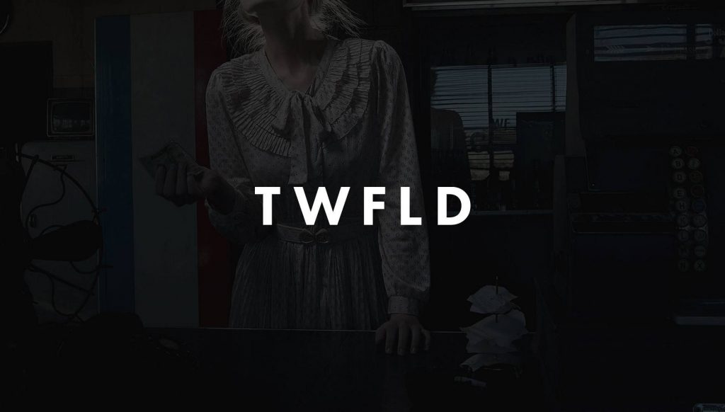
Have you ever been so confident about your work that you know you’ll succeed no matter what? That’s what we think with TwoFold.
TwoFold is our latest theme, and it’s already one of the best selling WordPress themes on ThemeForest’s “trending themes” list. With seven home layouts, six gallery designs and a unique structure of “galleries, albums and collections”, TwoFold is not only the most elegant-looking theme on the market, but also the most feature-packed one.
And you don’t have to use it just for photography websites: Here’s four ways to make use of TwoFold.
Vignette
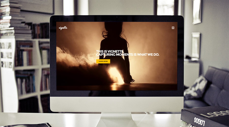
CSS Igniter always has original ideas, in terms of design, within their WordPress themes. Vignette is no exception: Bold typography and full-screen sliders (and a few tiny bugs), Vignette looks like a good choice.
Zoomy

If you’re looking for an extra-clean photography theme, Zoomy from Tesla Themes could be the theme you’re looking for. It’s actually looks more like a “multi-purpose” theme, but it could work wonders with your photography website.
Blocco
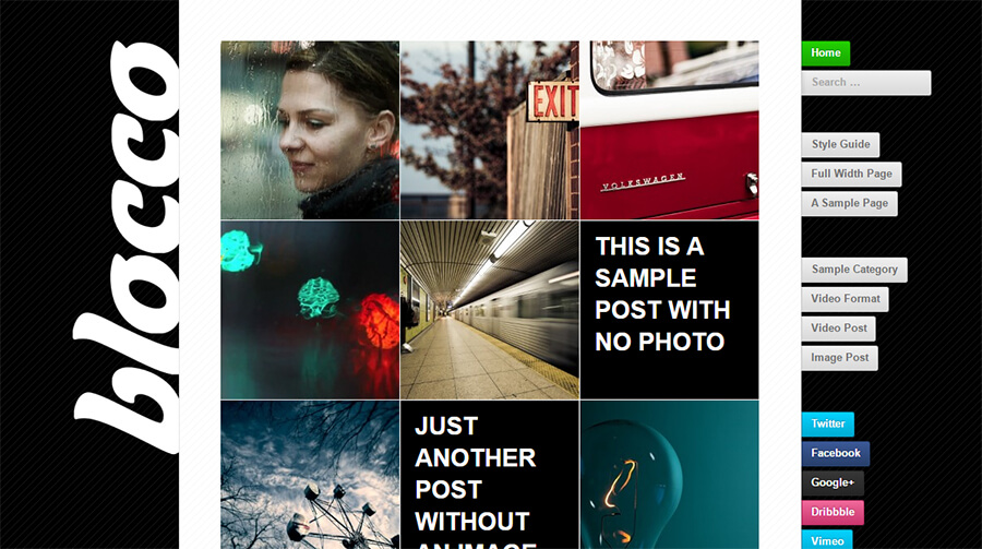
Here’s an unconventional design from Press75. Personally, I don’t like the right sidebar but with a few touches, you can shock your visitors–with awe, of course.
Portfolio

If you fancy to make a photography website with portfolio features, MyThemeShop’s “Portfolio” might be the one to suit your needs. With the tagline “Clean and Minimal Portfolio Theme”, Portfolio surely keeps its promise and delivers a clean and minimal design.
Photex
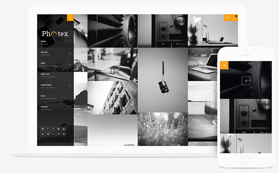
Coming after our own TwoFold, I think I like Photex the most. The grids strike the user right from the beginning, and I kind of love how they used the accent color strategically. Be sure to check this out.
Verticality

Although it seems to load a bit slower than other themes, Verticality looks like a good choice. The only downside, speed, is caused because the theme loads every page in a single page. Yup, this one’s actually a one-page theme. If you’re confident that you can optimize your pages for speed, this one’s for you.
Made
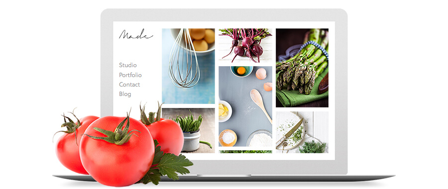
I’m not going to lie: Made (by Minimal) looks just as promising as TwoFold; and with the gigantic set of features, it surely trumps all the other themes I’ve mentioned above. But the price tag is really high (even though it’s for five themes, not one). Can’t stop you if you want to give it a shot, of course.
Conclusion
On a scale of 1 to 10, how do you like these themes? Tell us what you think (and your scores) in the Comments section below. And if you liked the article, don’t forget to share it with your friends.
Thanks for reading!
