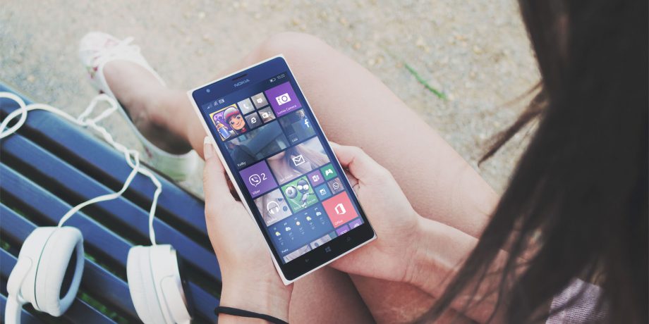
Which device are you reading this article on? Researches show that more than half of the page visits are made from a mobile device. Thus, it’s not just “important” to make your website look good on mobile, it’s “crucial”!
There are only a few practices to help your website design on mobile, and just two are used dominantly: responsive design and using mobile-specific themes (“mobile themes” for short). In this article, I’m going to talk about these two, and the benefits of using mobile WordPress themes.
Responsive Design vs. Mobile Theme
Let me tell this from the beginning: There’s no “magic solution” to any website, and neither of these two methods I’m talking about isn’t better than the other.
Responsive design is the method that makes the website respond to the screen the visitor’s viewing, and designs the page accordingly. That makes the page more elastic, allowing any number of device types according to the styling. It’s mainly a CSS technique and it gets help from HTML. To be honest, it’s an easier way to make your website mobile-friendly.
Mobile themes, on the other hand, are separately-coded designs that involve PHP as well, allowing your website to be viewed like that only if it’s viewed from a mobile device. That lets you code and design your website entirely differently on mobile views.
The main benefit of using mobile WordPress themes is that you don’t have to show (or try to hide) things for mobile visitors. In responsive design, you have to hide things for mobile users, which can cause problems with your design. In mobile themes, however, you don’t have to include anything you don’t want to include. That means you don’t have to show page elements and even refrain from loading certain styles or scripts. This makes it a more “optimized” approach for mobile devices.
How to Use Mobile WordPress Themes
Sadly, there aren’t many options available for mobile themes that you can use in WordPress. I mean, there are thousands of regular themes, while there are only about a hundred mobile themes. Still, that’s more than nothing.
WPtouch: Probably the most popular mobile WordPress theme out there, which works out of the box. Its free version allows you to create a generic mobile version of your website, while the “Pro version” lets you choose from a variety of different designs, and the possibility to fine-tune them.
Jetpack’s Mobile Theme: The incredibly popular Jetpack has a “mobile theme” module that generates a mobile theme with one click. Don’t expect too much, though.
Mobile themes on ThemeForest: If you want something for your taste, you can try out one of the mobile themes made by ThemeForest sellers and available on ThemeForest.
Contact us for a tailored design: Want something exactly for you, and nobody else? Tell us what you want in the contact page, and we’ll get back to you with a quote.
Conclusion
Using mobile WordPress themes isn’t the only right way–it’s one of the right ways. It’s a choice, depending on the type of your website. As you can see, in this blog, we’re using our own responsive theme. If this was a website that needed mobile themes, we would have used one.
What’s your take on this topic? Share your opinions with us in the Comments section below. And if you liked the article, don’t forget to share it with your friends!