WordPress is growing bigger and bigger every day, and it’s not going anywhere anytime soon.
And if you have a portfolio, you have only a few options to showcase them:
- Use WordPress.
- Use a network like Behance or Dribbble.
- Design and code your own website from scratch.
To be honest, I haven’t seen anyone who used the third option. Ever. And using Behance, Dribbble or any other network (Pinterest, maybe?) might seem kind of cheesy from the point of view of your potential clients, while being extremely useful. So, in order to look both slick and professional, WordPress is—probably—your best option.
What Makes a Good WordPress Portfolio Theme?
You wouldn’t just choose a decent-looking theme for your portfolio without any research, would you? You have to be careful and do your homework before you decide to buy or download a portfolio theme. And to do that, you need to look for some essential ingredients of a good WordPress theme. In this article, we’re going to go through a few of them.
A Slick Portfolio Grid Template

I think it’s safe to say that grids are the most essential parts of portfolio themes. Why? Well, because they are the best way to showcase your portfolio items, that’s why!
A Killer “Project/Product Details” Page Template

It would be pointless if that slick grid items doesn’t have any links, wouldn’t it? Aside from showing a bigger sized image, each item needs to be linked to a well-designed “details” page. If your portfolio consists of projects, look for a theme that has a “project details” page template. If you have products, look for a “product details” page template. Or, you know, look for both. Just in case.
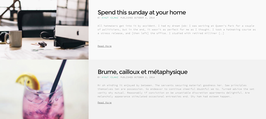
A Great Blog Template

You never know when you’ll need to tell some news to your visitors, or open your heart to them. That’s why, the theme of your choosing should have a nice “blog” template for you.
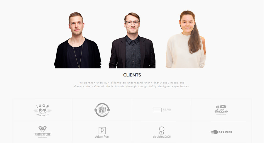
A Solid “About Me/Us” Page Template

Can you imagine a potential client thinking “Wow, this website have a nice portfolio and I don’t ever want to know more about who made these”? Of course they will want to know about you, or your team! Never, ever skip to look for a killer “about me” or “about us” template.
Generally A Good Taste in Design
Even if you pick a great portfolio grid template, cool “details” pages or awesome blog listings, you can’t have a complete theme without a good taste in design. Each and every single element of your portfolio website should be designed with care, and you should be careful when you pick a WordPress theme.
Our Pick of a Kickass WordPress Portfolio Theme
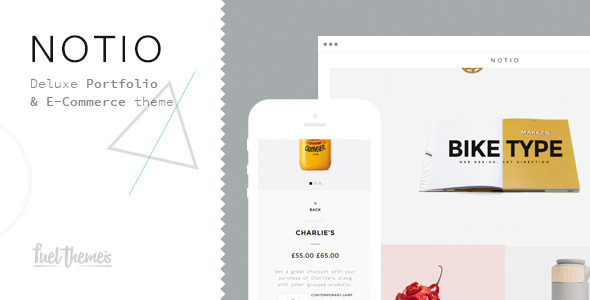
We, at Fuel Themes, try our best to bring people the best designs for your websites (or future websites). And for the folks with online portfolios to be published, we’ve created one of our best-looking themes in our own portfolio. Click here or below to see Notio – Deluxe Portfolio Theme on ThemeForest:
In Notio, naturally, you can find all the essential parts that should be in a portfolio theme: Slick portfolio grid templates (masonry, full grid and more), killer page templates for both “Products” and “Projects” pages, greate templates for both “About Me” and “About Us” pages, an awesome blog template for your blog posts, and many, many more! Be sure to check it out before you decide on a portfolio theme.
Conclusion
Do you have anything to add to this article? If so, don’t hesitate to share your thoughts with us in the Comments section below.
Goodbye!
